Why screens differ
You paint on a bright laptop IPS panel; the viewer sees an OLED phone with a different gamma. The image did not “break”—there is no shared reference without agreed profile and brightness.
Default brightness is too high
Stores ship screens at 250–350 cd/m² and up so demos look punchy. For long sessions that tires your eyes and skews decisions: you darken shadows because the panel glares, then export looks muddy.
Different color profiles
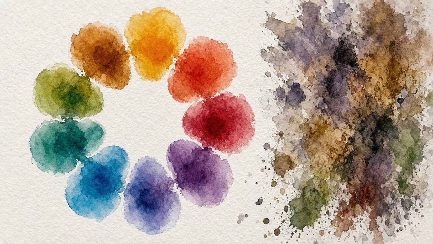
The monitor may show wide P3, the OS sRGB, the browser another interpretation. Without aligned profiles the same HEX shifts hue. A display tablet adds a third source if you do not calibrate it separately.
Basic setup without tools
A colorimeter helps, but free steps—brightness, contrast, gamma, and checking on your phone—fix most publishing surprises.
120 cd/m² as a target
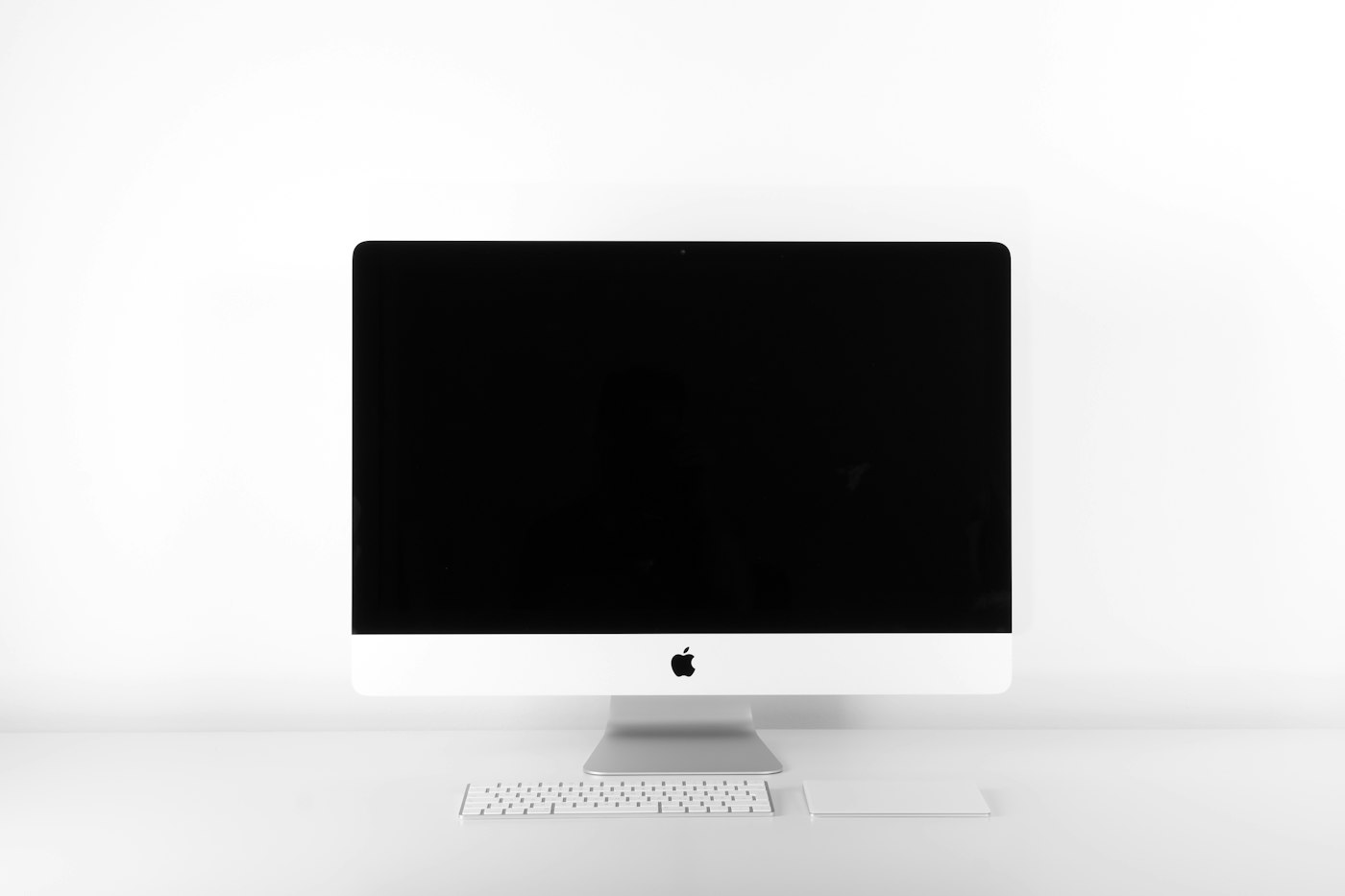
In a dim room, aim for about 100–120 cd/m² (use cd/m² in the monitor menu if available; otherwise lower brightness until white in the editor is comfortable, not blinding). With daylight from a window you can nudge brightness up, but avoid factory max.
Contrast and gamma
Leave contrast around 70–80% of max or factory if gradients have no banding. Gamma 2.2 is standard for sRGB and most exports. Turn off game and movie modes—they boost saturation. Quick manual pass without hardware:
- reset the monitor to factory, then disable dynamic contrast;
- lower brightness until the editor white is comfortable;
- set gamma 2.2 or sRGB mode in the OSD;
- open a gray gradient and confirm there are no harsh steps.
sRGB as the standard
Unless you are targeting wide-gamut print, sRGB is the common language of the web, social feeds, and most print shops.
Enable sRGB on the monitor
In the monitor OSD pick sRGB or 6500K color temp without dynamic contrast. Disable auto-brightness if it jumps when you change desks. On laptops check the vendor utility for the same.
Profile in the system
On Windows: Color Management → assign sRGB IEC61966-2.1 to the display. On macOS sRGB is usually default; for an external monitor assign a profile after calibration or sRGB mode. In the editor turn on profile mismatch warnings so you do not paint accidentally in Adobe RGB.
Check
Export test squares of pure red, green, and blue (#FF0000, #00FF00, #0000FF) and open them on your phone at medium brightness. A strong yellow or green shift on the phone while the monitor looks fine means fix sRGB and brightness before repainting blind.
Test images
Test patterns are free and show banding, clipping, and wrong gamma faster than comment arguments.
Gradient without banding
Display a smooth black-to-white gradient full screen. Visible steps at 10–90% gray mean aggressive contrast or low bit depth. Light texture on one panel may be normal; hard steps are not.
Gray patches
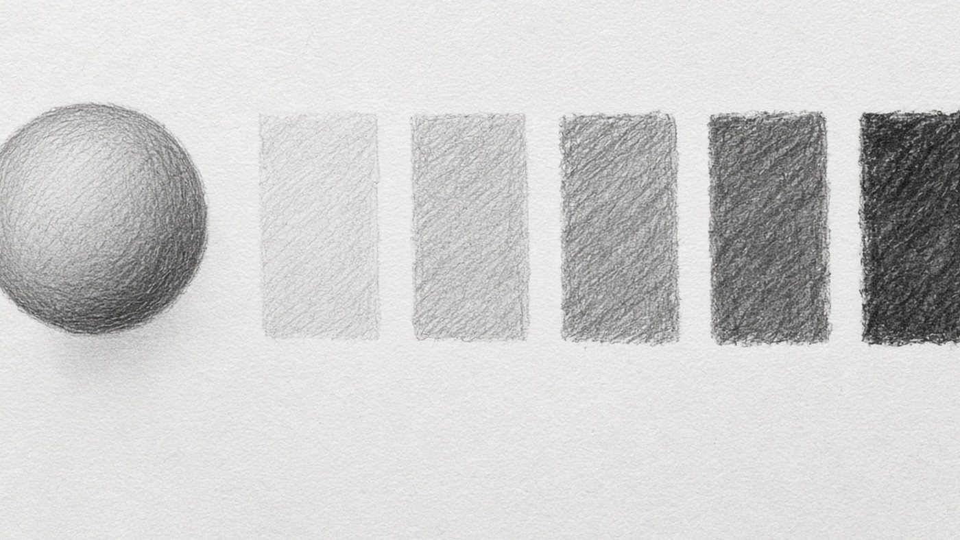
Charts with 5%, 10%, 50%, and 90% gray show whether shadows and highlights get crushed. If 5% and 10% merge, lower brightness. If 90% and 100% match, contrast is too high.
Display tablet separately
A display tablet is a second screen with its own panel. “I calibrated the monitor” does not mean the tablet matches.
Two screens — two profiles
Set sRGB or the maker profile on both where the menu allows. Windows can assign different profiles to display 1 and 2. If you paint on the tablet, check final export on the screen your audience uses—often phone or main monitor.
Check against your phone
A phone is not a color standard, but it is how viewers habitually see art. After brightness changes, spend a week sending PNGs to yourself in a messenger. Export without extra compression is covered in export without quality loss. If you only work on a display tablet, still open the file on a second device before posting.
- once a month rerun the gradient test after driver updates;
- do not calibrate with direct sun on the screen—light changes perception;
- turn off OS night mode while doing color work.
Display and monitor follow the same logic as pen tablet plus PC screen—see how to set up a graphics tablet if pen and color feel out of sync because of the driver.
Time to draw, not just read
Theory fades in a couple of days if you never use it. Open the editor and spend 15 minutes on what you just read. That is enough for the skill to stick.
Try it now
A free online editor: brushes, layers, a palette, and a shared canvas. No install and no sign-up.
Start drawingTopics in this guide
- monitor calibration
- sRGB for drawing
- monitor brightness
- on-screen color
- monitor for artists
← File Organization: Keep Your Art and Your Sanity Tablet Express Keys: Reach for the Keyboard Less →