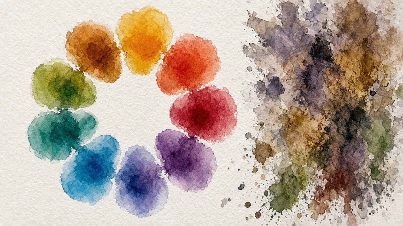
Three properties of color
Any hue can be described with three numbers, and that is enough for full control. While you think "I need a nice blue," the result is a guess. When you think "blue, saturation 40, lightness 70," it is predictable.
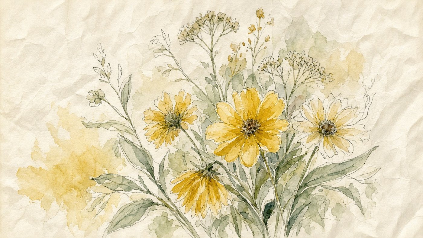
Hue, saturation, lightness
- hue: where the color sits on the color wheel, red, yellow, or blue;
- saturation: how vivid the color is, from pure down to gray;
- lightness: how much lighter or darker it is than middle gray.
Lightness is easier to check in black and white: a bright yellow is almost white, and a saturated blue is dark.
How the sliders control them in an editor
A color picker almost always has three scales. Drop saturation to 30 percent and leave the lightness alone, and you get a muted hue for the background. Building a palette that way is faster than mixing paint blind.
Why you get mud
Mud is a color with low saturation and an unclear hue. It shows up for two reasons, and both are easy to remove.

Mixing opposites
Red with green, blue with orange, and yellow with violet make a brownish blot. Those pairs sit opposite each other on the wheel and kill saturation. If you want a muted hue, add the opposite color a drop at a time, not half a brushload.
Too many saturated spots
When every color shouts, none of them stands out. Leave one spot saturated, the focal point, and mute the rest by 30-50 percent.
Warm and cool
Split the wheel in half. Red, orange, and yellow are the warm half. Blue, light blue, and green are the cool half. That pair works as a second contrast, alongside light and dark.
Warm light, cool shadow
An incandescent lamp gives a warm yellow light, and the shadow picks up bounce from the sky and the walls, so it shifts toward a cool blue. The rule also runs the other way: on an overcast day the light is cool, and the shadow warms up. You can see the mechanics in the examples in the article on reflected light.
Building depth with color
Warm colors come forward. Cool colors recede. Make the foreground warmer and higher in contrast, and the distance cooler and paler, and depth appears without a single vanishing point.
Ready color schemes
A scheme saves time: you do not pick hues at random. You take a ready relationship off the wheel. A full breakdown with examples is in the piece on the color wheel.
Complementary and triad
Complementary means two colors opposite each other: maximum contrast, good for a poster and an accent. A triad is three colors at equal steps around the wheel. It feels lively, but one color has to stay in charge.
Analogous and monochrome
An analogous scheme is 2-3 neighboring hues, light blue, blue, and violet, for example. It always looks calm and whole. Monochrome is one hue at different lightness and saturation: the best choice for your first studies.
Shortcut
Convert your work to black and white. If the picture falls apart into a gray mess, the problem is value, not color. Fix the lightness first, then the hues.
A palette of 3-5 colors
Thirty hues in one piece almost always look cheaper than four. A limit makes the picture whole, and it speeds the work up too.
How to choose a dominant and an accent
- Choose a dominant, the color that will cover about 60 percent of the area.
- Add a supporting hue for 30 percent: it should be related to the dominant.
- Leave 10 percent for the accent, the most saturated color in the piece.
- Put the accent only at the focal point, and nowhere else.
- Build the shadows and the background from mixes of the colors you already chose.
Limitation as a method
For a month, paint studies with three paints: blue, red, and yellow, plus white. You will learn to get the hue you want by mixing, not by buying a new tube.
Practice with the eyedropper
The eyedropper in an editor is a learning tool, not a cheat. It shows the real color instead of the one you think you see. Ready sets are easy to collect with an online palette.
Reading the palette of someone else's work
Open a painting you like and sample 8 points with the eyedropper: light, shadow, background, accent. Lay them out as squares in a row. Often a "bright" piece is built from muted colors and one saturated spot.
Recoloring your own drawing
Take an old drawing, duplicate the layer, and recolor it to a new scheme, from a triad to an analogous set, for example. Do not change the values while you do it. Comparing the results is easier if you already check work against the value scale.
Time to draw, not just read
Theory fades in a couple of days if you never use it. Open the editor and spend 15 minutes on what you just read. That is enough for the skill to stick.
Try it now
A free online editor: brushes, layers, a palette, and a shared canvas. No install and no sign-up.
Start drawingTopics in this guide
- color theory
- color in drawing
- palette for beginners
- saturation and lightness
- warm and cool colors
← Light and Shadow: How to Turn a Flat Drawing into Volume Anatomy for Artists: How to Study So It Shows in the Drawing →