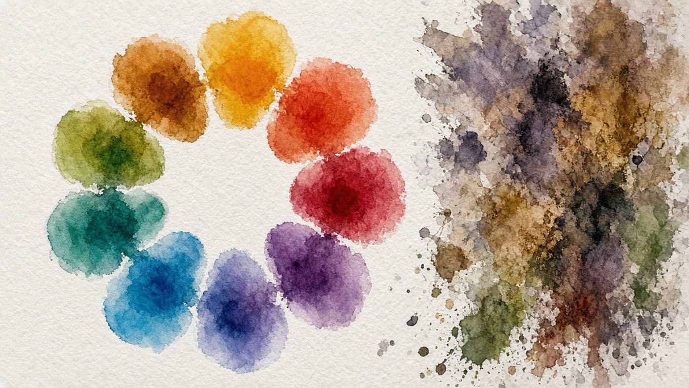
How the Color Wheel Is Built
The color wheel is the spectrum wrapped into a ring. Neighboring hues are similar, and opposite hues contrast as much as they can. The distance between two colors on the wheel is the strength of their contrast. Remember that logic, and picking colors stops being a guessing game.
Primary, Secondary, Tertiary
The wheel is built in three levels:
- primary: red, yellow, and blue, which you cannot get by mixing;
- secondary: orange, green, and violet, mixes of the primaries next to them;
- tertiary: yellow-green, blue-violet, and four more hues in between.
That makes 12 sectors, enough for any palette.
RYB and RGB: What Is Different
The classic artist's wheel is built on red, yellow, and blue, the way paint behaves on paper. A screen works differently. Its base is red, green, and blue, and mixing produces light, not mud. In an online editor you are looking at RGB, so cyan and magenta look cleaner there than they do in gouache.
Color Schemes
A scheme is a ready-made template for picking points on the wheel. Five schemes cover almost any job, from a poster to a portrait.

Complementary and Split-Complementary
A complementary pair is two colors opposite each other, for example blue and orange. That is the strongest contrast, so you take one color as the main color and keep the second for an accent. A split-complementary scheme is softer: instead of the opposite color, you take the two colors next to it.
Triad and Tetrad
A triad is three colors at equal distance, the corners of an equilateral triangle inside the wheel. It is bright and lively, and it suits illustrations and characters. A tetrad takes four colors as two complementary pairs and needs discipline. Without a clear main color, the piece falls apart.
Tip
Never take the colors from a scheme at full strength. Mute two of the three by lowering saturation 20-40 percent, and leave only the accent as bright as it can be.
Analogous and Monochrome Palettes
Sometimes you need a mood, not contrast. Schemes made of close hues do that work.
Calm Pieces
An analogous palette is three or four neighboring sectors of the wheel, for example yellow, yellow-orange, and orange. A piece like that reads as a sunset or a foggy morning. Monochrome goes further: one hue, and only changes in lightness and saturation.
How to Add an Accent
A calm palette gets dull fast without one bright spot. Take the color opposite your analogous group and fill no more than 5 percent of the canvas with it. In a blue-green landscape, that might be one orange roof. Saturation and lightness are covered in the article on color theory.
Color Proportions in a Piece
A scheme tells you which colors to take. It does not say how much of each to put down. Proportion is what decides whether the piece holds together or turns busy.
The 60-30-10 Rule
- Give 60 percent of the area to the dominant, usually the calmest color.
- Let 30 percent go to a supporting color from the same scheme.
- Leave 10 percent for the accent, the brightest and most saturated color.
- Check the proportions by squinting at the piece from a meter away.
Dominant and Accent
The dominant sets the mood and covers the background, the large masses, and the shadows. Place the accent where the eye should stop, usually the face, the light source, or the main object. If there are more than two accents, the eye darts around and the composition loses its focal point.
Practice
Color-wheel theory sinks in over an evening if you build several palettes by hand right away.
Build 5 Palettes from the Wheel
Make five strips of five squares each: complementary, split, triad, analogous, and monochrome. Fill the squares in the editor and label the scheme. The eyedropper lets you sample hues quickly. More on it is in the piece on picking color online.
Recolor a Piece by Scheme
Take an old drawing and recolor it three times with different schemes. Keep each version on its own layer and toggle visibility to compare them. This shows up especially clearly on a landscape. Try it on your own landscape, once with a sunset and once with a cold morning.
Time to draw, not just read
Theory fades in a couple of days if you never use it. Open the editor and spend 15 minutes on what you just read. That is enough for the skill to stick.
Try it now
A free online editor: brushes, layers, a palette, and a shared canvas. No install and no sign-up.
Start drawingTopics in this guide
- color wheel
- color combinations
- complementary colors
- color schemes
- how to pick a palette
← Value Scale: a basic exercise for value control Atmospheric Perspective: how to draw distance, fog, and depth →