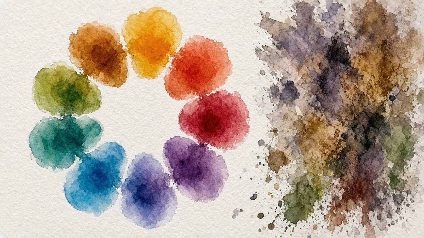
Three ways to pick a color
You do not need to guess color by eye. There are three reliable sources: a real photo, the color wheel, and ready-made sets. All three are available right in the browser.
An eyedropper on a photo
The fastest way to a believable color is to sample it from a photograph. Find a reference with the lighting you want, open it on the bottom layer, and click the eyedropper on the interesting spots. Take five or six samples: light on the object, the midtone, the deep shadow, the bounce light, and the background.
Save the colors as strokes in a corner of the canvas and work only from them. The palette will hold together.
The color wheel
Use the wheel when you have no photo and you are inventing the color. It shows which hues get along: neighbors make calm combinations, opposites make contrast. The schemes and the logic are covered in the article on the color wheel and color combinations.
Ready-made palettes
Online palette generators hand you sets of four or five colors with codes. Those palettes are built without regard to value, so in a drawing they often look flat. Use them as a hint for the hues, and set the lightness yourself.
HSB sliders in practice
HSB is the clearest way to control color. Three sliders instead of six numbers, and each one handles a separate property.

Hue, saturation, and brightness
Hue (H) is the position on the wheel, from 0 to 360 degrees. Saturation (S) is how pure the color is: 0% gives gray, 100% gives the brightest hue. Brightness (B) is the lightness, from black to the full color.
For an illustration, keep saturation in the 40–80% range. Anything above 90% hurts the eye.
How to get a shadow that still has color
The main mistake is to simply drop the brightness. The shadow turns muddy. Do this instead:
- Sample the object's local color with the eyedropper.
- Lower brightness (B) by 20–30%.
- Raise saturation (S) by 10–15%.
- Shift hue (H) by 15–30 degrees toward the cool side.
- Compare the colors side by side: the shadow should still look like a color.
For light, reverse it: higher brightness, lower saturation, and a hue shifted toward yellow.
Check the palette
Pretty colors in the swatches do not yet mean a good piece. Check the palette with two tests, and both take a minute.
The black-and-white test
Add a desaturate layer on top and look at the drawing. If the objects merge into one gray blob, the colors share the same lightness, and the palette is not working. Separate the values: the main subject should be clearly lighter or darker than the background. How to build those differences is shown in the guide to a value scale.
Contrast between text and background
If the piece will carry a caption, a title, or a logo, check that it can be read. Dark text needs a light background, and the reverse. Thin type on a busy background is never readable. It needs a flat color block or a blur behind it.
Check
Look at the palette on your phone a couple of hours later, not in the editor. A fresh look and a different screen show the imbalance immediately: the piece will be either too yellow or too dark.
How color is spread across the piece
Even a perfect palette falls apart if every color takes the same amount of space. The eye needs a hierarchy: one color leads, and the others support it.
The 60-30-10 rule
Split the area of the piece by proportion: 60% is the main calm color, 30% is the supporting color, and 10% is the accent.
- 60%: background and large masses, low saturation;
- 30%: the main subject and its color;
- 10%: the accent, the brightest detail.
One accent per frame
Two bright spots argue with each other, and the eye does not know where to go. Keep one accent and place it on the focal point of the piece. Quiet the other bright spots by 20–30% saturation. Composition in a drawing helps you choose where that accent goes.
Where to keep palettes
A combination you found is easy to lose between sessions. Keep two simple stores: one inside the editor, and one outside it.
Your own sets in the editor
In the editor you can save colors into your own set and name it: "sunset", "portrait, warm light", "cool forest". Keep the sets small, five to seven colors. It also helps to duplicate the palette as strokes on a separate layer inside the file.
A screenshot library
Keep a folder of film frames, photos, and other people's work where the color caught you. When a palette will not come, sample colors from there with the eyedropper. The same kind of folder is useful for subjects, not only for color. More on that is in the article on where to find inspiration.
Time to draw, not just read
Theory fades in a couple of days if you never use it. Open the editor and spend 15 minutes on what you just read. That is enough for the skill to stick.
Try it now
A free online editor: brushes, layers, a palette, and a shared canvas. No install and no sign-up.
Start drawingTopics in this guide
- pick colors online
- color palette online
- eyedropper tool
- HSB sliders
- palette generator
← Line stabilization and pressure: tune the pen to your hand Export without quality loss: an export checklist →