Why composition still matters when the drawing looks good
Composition decides where the viewer's eye goes, and in what order. A careful drawing without it looks like a display where everything is lined up evenly and alike: there is nothing to look at.
How the eye reads a picture
The eye catches the most contrasting shape, then slides along lines and edges. If there are five contrasting shapes, the eye jumps around and gets tired. If there are none, the viewer leaves in a second.
The "squint" check
Step back two meters and squint until the details disappear. Large shapes of light and dark remain. That is your composition.
The focal point: one subject in the frame
A piece needs one main object, one secondary object, and everything else as surroundings. Two equal subjects will compete with each other, and the frame will fall apart.

Contrast as a pointer
You can set the subject apart in five ways, and two or three at once are enough.
- value: the lightest area sits next to the darkest, and it sits on the subject;
- color: the only saturated spot among muted ones;
- size: the subject is larger than its neighbors;
- detail: a sharp edge and small parts only at the focal point;
- isolation: more empty space around the subject than around the other objects.
Leading lines
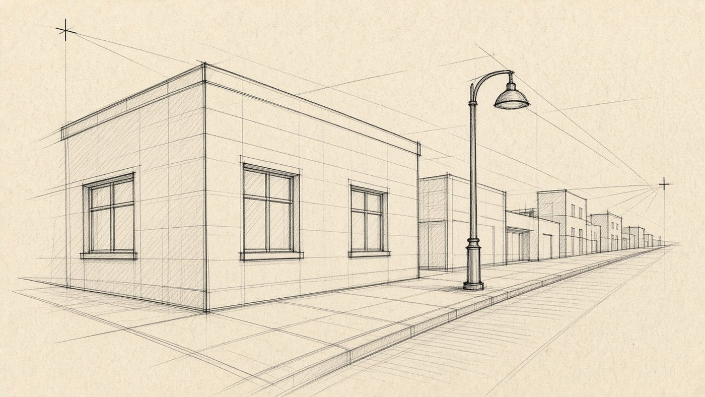
A road, the edge of a table, a shadow, a character's gaze, a branch: all of these are arrows. Turn them toward the subject, not off the page. Rotating a shadow by 20 degrees changes the piece more than an hour of detail.
The rule of thirds and the golden ratio
Divide the page into nine parts with two verticals and two horizontals. The four crossings are power points, and an object on any of them feels more alive than one placed dead center. The golden ratio splits the page at about 62 to 38, but by eye the difference barely reads. Sample frames are in the article on the rule of thirds.
A 3x3 grid in the editor
Turn on guides, or make a separate layer with two verticals and two horizontals at 30 percent opacity. Move the objects until the main one sits on a crossing, then hide the layer.
When you can break the rule
The center fits symmetry, a portrait seen head-on, and a minimalist poster. It gives calm. Break the rule on purpose: "I put the subject in the center to strengthen the frontal view" is a decision. "It just came out that way" is not.
Balance of masses and breathing room
Imagine the page resting on an invisible support at the center. Shapes have weight, and the picture should not tip to one side, though it does not have to be symmetrical to stay upright.
A heavy spot and a light spot
A small black shape outweighs a large gray one, and a saturated red is heavier than a pale blue of the same size. So one dark figure on the right can balance a light mountain on the left. The mechanics of weight are covered in the piece on rhythm and balance.
How much empty space to leave
Empty space is not "unfinished." It is where the eye rests. For a start, give one third of the page to the objects and two thirds to air, and do not press anything against the very edge.
Check
Turn the drawing upside down and look for 10 seconds. The story disappears. Shapes and their placement remain. If the composition still reads, it is not held up by how recognizable the objects are.
Ready layouts for practice
A layout is a frame you hang the subject on. Keep four of them in mind. They help most in a landscape, where there are many objects and it is easy to get lost.
Diagonal and triangle
A diagonal gives movement: run the main line from the lower left corner to the upper right. A triangle does the opposite and stays stable: three objects of different heights, with the peak on the main one.
Circle and foreground frame
A circular layout keeps the eye inside the frame: objects sit on a ring, and the center is empty. A foreground frame is a dark object at the side of the foreground, a branch or the corner of a house, for example. It sets three planes at once.
How to check a composition in 30 seconds
Check before you work, not after three hours of hatching. The two methods below take less than a minute.
A 5x5 cm thumbnail
- Draw four squares of 5 cm on the page.
- Sketch the same scene four times: subject on the left, on the right, close up, and far away.
- Fill the shapes with three values: light, middle, and dark, with no details.
- Step back two meters and pick the square that reads first.
- Enlarge only that one to the full page.
A mirror flip
Flip the work horizontally: one button in the editor, a mirror on paper. The eye stops recognizing the familiar picture and notices the skew, an empty corner, a horizon that has tipped.
Time to draw, not just read
Theory fades in a couple of days if you never use it. Open the editor and spend 15 minutes on what you just read. That is enough for the skill to stick.
Try it now
A free online editor: brushes, layers, a palette, and a shared canvas. No install and no sign-up.
Start drawingTopics in this guide
- composition in drawing
- composition rules
- focal point
- cropping a drawing
- balance in composition
← Perspective: How to Draw Depth Without Hard Geometry Light and Shadow: How to Turn a Flat Drawing into Volume →