Why pixel art is a good place to start
A small canvas gives you nowhere to hide behind blending. Every pixel is a decision, and you can actually finish a sprite in an evening.
Limits instead of a blank page
A 32×32 canvas and a palette of six colors settle the question of where to start: silhouette, light, one detail.
You do not need a steady hand
A pixel is placed with a click. A shaky hand barely matters. What matters is counting and the eye. You assemble the line from cells, like a mosaic.
Setting up the canvas
Set up the editor first, or smoothing will eat the style before the first patch.
16×16, 32×32, 64×64
16×16 is an icon: a silhouette and two or three patches. 32×32 is a first character: head, torso, and legs still read. 64×64 already holds clothes and a scene, but the temptation to break everything into pieces grows. Start at 32×32. How to choose a program is in the article on how to draw in an online editor.
Turn off brush smoothing
Turn off anti-aliasing, set hardness to 100%, and set the size to 1 pixel. A translucent edge breeds dirty colors outside the palette. The eraser is hard too, one pixel. Switch off the soft round brush right away.
Zoom and the grid
Work at 800–1600% zoom, close enough to see the cell. Keep a 100% preview nearby: what looks good zoomed in lies. A 1×1 grid keeps you from losing count. Nudge with the arrow keys, one pixel at a time. The line stays cleaner than a freehand brush.
A limited palette
Five to eight colors teach you to choose a value. Build the palette before the silhouette, and do not expand it "just this once."
5–8 colors are enough
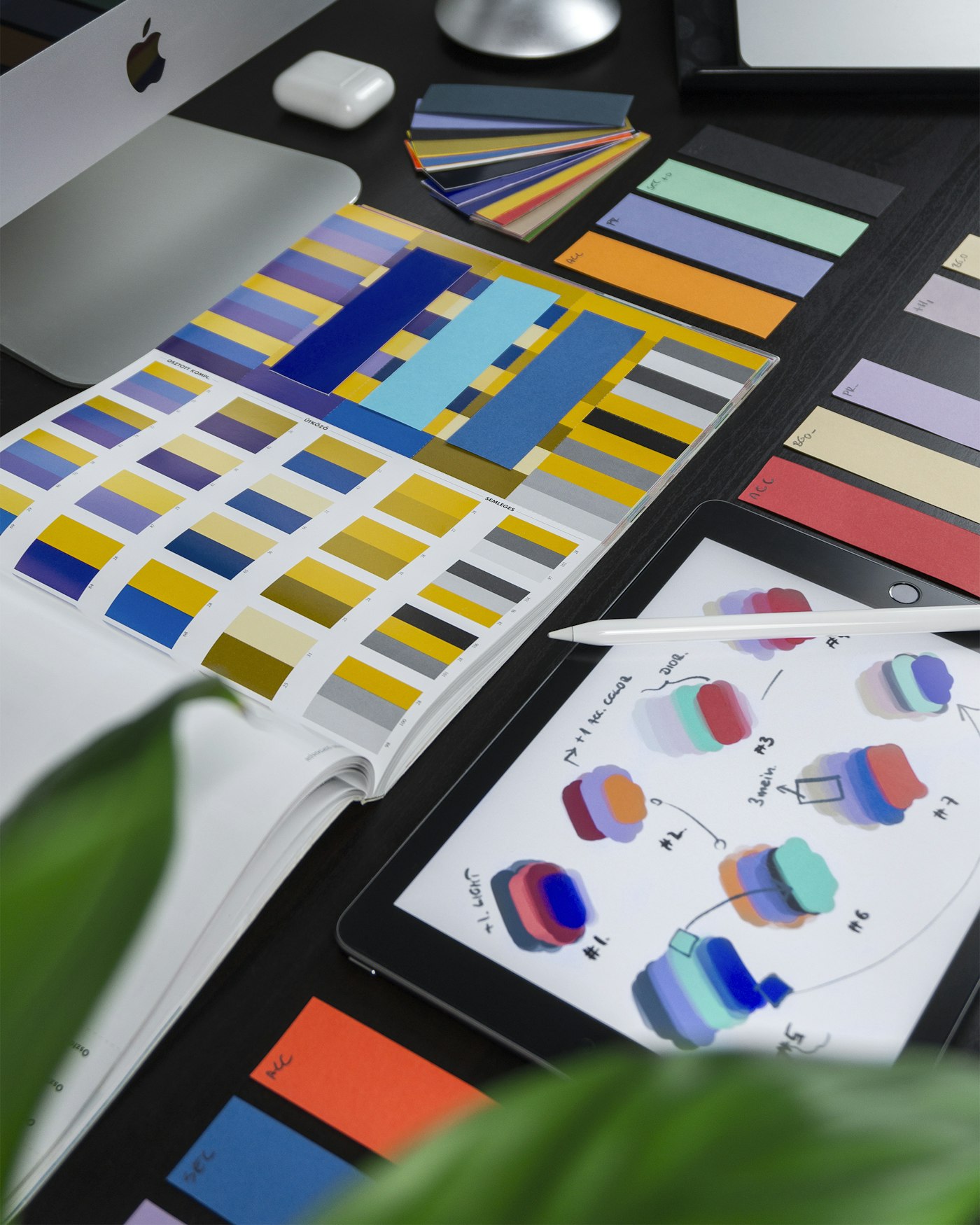
Take a dark contour, a local color, a light, a shadow, and a background color. For a character, add one accent, hair or a buckle. Eight colors is already generous. Write the HEX values on a legend layer so you do not pick "almost the same" brown.
Warm light and a cool shadow
Shift the light toward yellow or pink, and the shadow toward blue or violet. Do not take the shadow as "the same color, only darker": you get mud. The pairs are covered in the article on color theory.
Lines and silhouette
Start with a black shape on a contrasting background. If the filled silhouette is not recognizable, color will not help.
A clean pixel line without "stairs"
A "stair" is steps of uneven length on one slope: 3-1-4-2 instead of 2-2-2. Keep the step the same. Remove double pixels on a corner: a corner is one cell. The contour is 1 pixel thick, and the inside is a fill.
Readability at a small size
Turn the zoom off. Head, torso, and legs should remain patches of different shapes. A limb at 1 pixel disappears, and one that is too thick sticks to the body. Leave a one-cell gap between the arm and the torso if the pose allows it. The same idea of a readable contour is in line art.
Tip
Save a copy, scale it down to 16×16, and look. Whatever disappeared was extra. Go back to 32×32 and cut those details out.
Shadows, anti-aliasing, dithering
Volume on a grid is built from three values. Smoothing and a checkerboard are spot techniques, not the background of the whole piece.
Three values on an object
Local color, light, and shadow are enough for a cube, a cloak, and a face. Light is a patch on the side of the light source, and shadow is on the lower and farther plane. Tint the contour slightly with a neighboring value so it is not a foreign wire.
When you need dithering
Dithering is a checkerboard of two palette colors. You need it on planes of 64×64 and up, where the transition would otherwise be a step. At 32×32 it almost always looks noisy. Do not mix it with anti-aliasing in the same corner. Anti-aliasing here is 1–2 pixels of an in-between color on a diagonal, not a soft brush.
Your first sprite, step by step
Build a 32×32 character in one sitting. The goal is a readable silhouette, not eyelashes.
- A 32×32 canvas, a hard 1 px brush, a grid, and 800% zoom.
- A silhouette in one dark color: head, torso, legs.
- Fill local colors from a palette of 5–8 hues.
- Place light and shadow, one patch per plane.
- Add one detail: a buckle, a lock of hair, or a 2×2 eye.
- Export a PNG with nearest neighbor, and no blur.
Silhouette → color → shadow → details
Do not start with the eye. The order is strict: shape, color, three values, small stuff. If a detail does not read at 100%, erase it. An empty shoulder is better than a mush of five pixels of "armor."
Export without blur
- PNG, not JPG: compression dirties the palette;
- scale by 4, 6, or 8 with nearest neighbor;
- do not use bilinear smoothing. The sprite will smear;
- keep the background separate, or transparent, if you need a game object;
- leave the source in the editor file, with layers.
Why JPG hurts small graphics is covered in the breakdown of PNG, JPG, and SVG formats.
Time to draw, not just read
Theory fades in a couple of days if you never use it. Open the editor and spend 15 minutes on what you just read. That is enough for the skill to stick.
Try it now
A free online editor: brushes, layers, a palette, and a shared canvas. No install and no sign-up.
Start drawingTopics in this guide
- pixel art for beginners
- how to draw pixel art
- 32×32 sprite
- pixel art palette
- dithering
← How to Draw Cities and Architecture: A Street in Perspective Chibi and Cute Characters: The Rules That Make Kawaii Work →