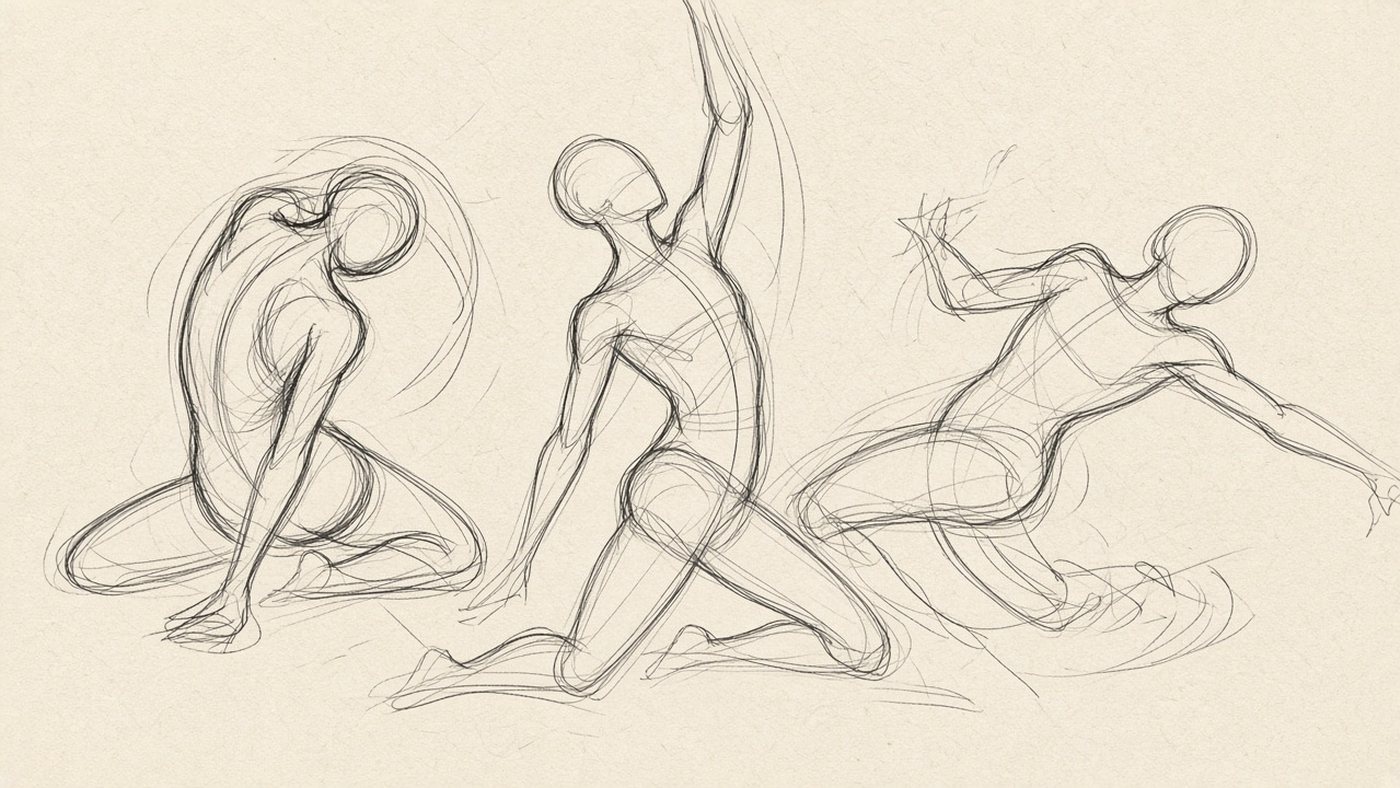
Texture is not the same as detail
Texture is how a surface responds to light: absorbs it, scatters it, or reflects it. Beginners hatch every pore in wood and lose the volume. Two or three cues are enough for a viewer to read the material from across the room.
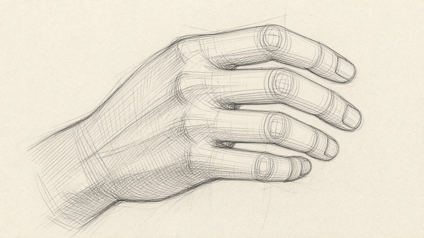
Two cues for a material
Pick a pair: for wood—grain direction and a soft highlight; for metal—a sharp highlight and a dark mirror of the environment; for fabric—a soft fold without a hard reflection. The rest is noise. If both cues are in place, you can skip the tiny lines.
Scale of the stroke
The stroke should be smaller than it looks in the photo. At arm's length, heavy "grain" turns into blotches. Save micro-texture for the last pass and only in the focal zone—or the picture buzzes.
Matte surfaces
Matte materials give no mirror highlight: light falls off smoothly and shadow edges stay soft. They are easiest to learn with one light source from the side.
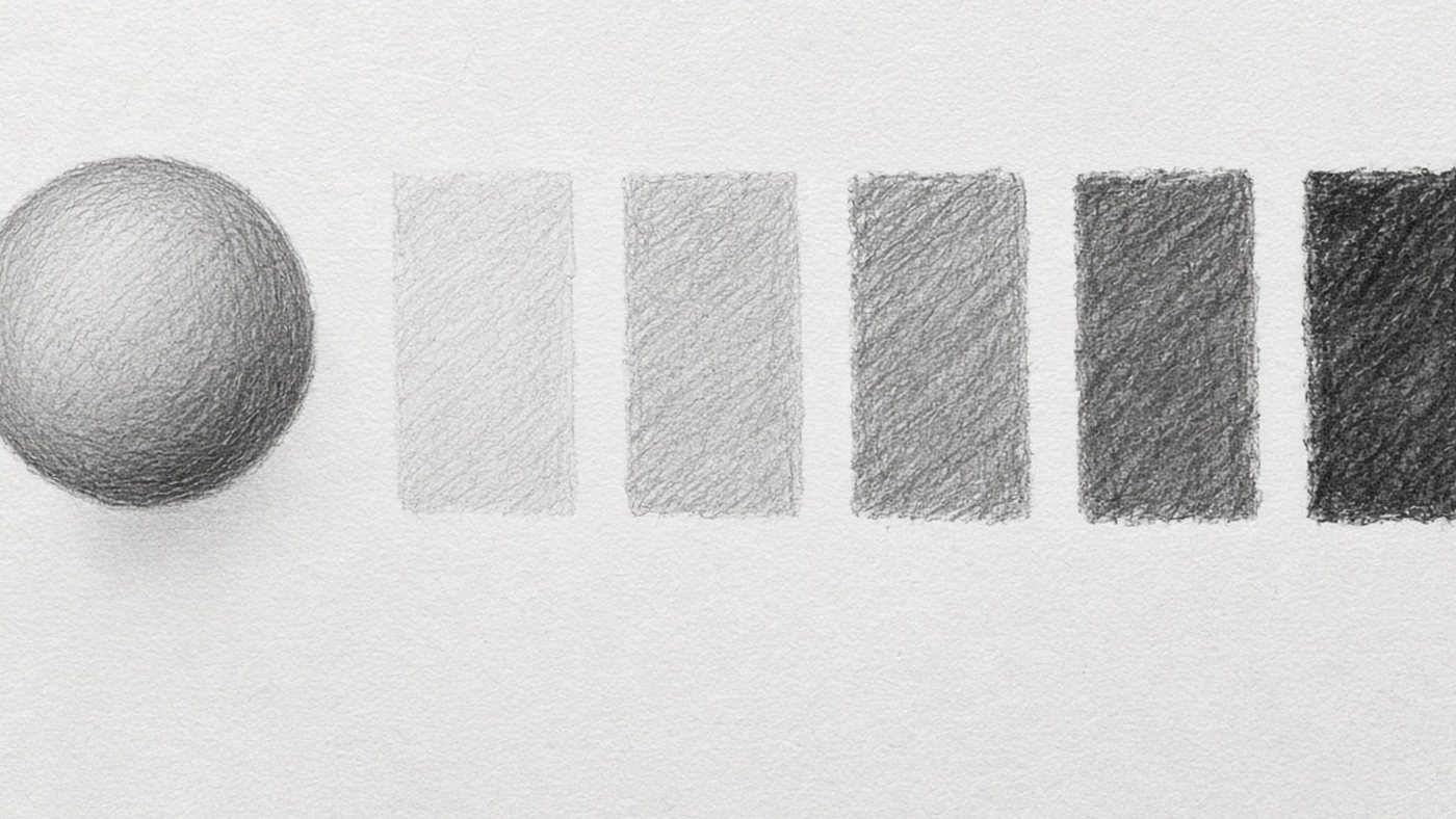
Wood and stone
Wood: long arcs along the form, not across the volume. A light edge on the board rim, two or three values inside—no black cracks. Stone: large planes, broken contour, rare cracks—not a grid, three or four accents. Volume comes from light and shadow; texture only hints at the material.
Fabric and paper
- fabric—soft light transition, sharp only at a seam fold;
- paper—almost flat tone, slight yellow at the sheet edge;
- do not draw every fold: one main fold and two supporting ones;
- mute a fabric background so it does not fight the object.
Highlights and reflections
Smooth materials read through contrast between highlight and dark. The mistake is a white highlight with no half-tone around it—it floats above the form.
Metal: a sharp highlight
A metal highlight is short and hard, often stretched into a strip. Next to it—an almost black mirror of the surroundings. Keep a gradient: light → half-tone → dark reflection → light on the opposite edge. Build form from simple volumes; put the highlight last.
Glass: refraction and edge
Glass is transparent, but the rim catches light—trace it with a light line. Inside—distortion of the background, not a "drawing on glass." The bottom of a mug reads darker than the wall. One strong highlight on the rim and broken background lines behind the wall are enough to read it.
Skin and soft materials
Skin and rubber sit closer to matte, but with a narrow band of highlight on wet or oily zones. The main job is smooth value—no hatch shaped like parallelograms.
Smooth value transition
Split the form into three zones: light, half-tone, shadow. Blend or hatch with increasing density without changing direction every two millimeters. Bone under skin gives a slightly lighter ridge—not white, half a step lighter than neighboring flesh.
Micro-texture last
Pores and fine lines—only in the light and only on a large sheet. On a portrait, a light noise layer on the half-tone edge beats dots. For the face, structure matters more: see anatomy for artists; do not put skin texture before proportions.
Common mistake
The same hatching on wood, metal, and fabric. Viewers read material by highlight contrast and gradient shape, not by squiggles. Change the highlight—the material changes, even if the stroke stays the same.
Practice on one object
A mug, ball, or apple is a neutral form. Five materials in a row teach you to swap surface language without changing geometry.
One mug in five materials
- Draw the contour and base shadow once.
- Duplicate the layer four times: ceramic, metal, glass, wood, fabric sleeve.
- On each copy change only the highlight, edge, and two texture strokes.
- Compare side by side: where the material reads at a glance.
- Remove extra strokes where recognition does not drop.
Material checklist
Before finishing, ask: is the highlight right (sharp or soft)? Is there direction or a plane typical of the material? Is texture louder than form? If form sags—soften texture, do not add detail.
Time to draw, not just read
Theory fades in a couple of days if you never use it. Open the editor and spend 15 minutes on what you just read. That is enough for the skill to stick.
Try it now
A free online editor: brushes, layers, a palette, and a shared canvas. No install and no sign-up.
Start drawingTopics in this guide
- textures in drawing
- how to draw materials
- how to draw metal
- wood texture
- how to draw glass
← Negative Space: How to Draw the Emptiness Around an Object The Golden Ratio in Composition: Practice Without Mystique →