The base of a seascape
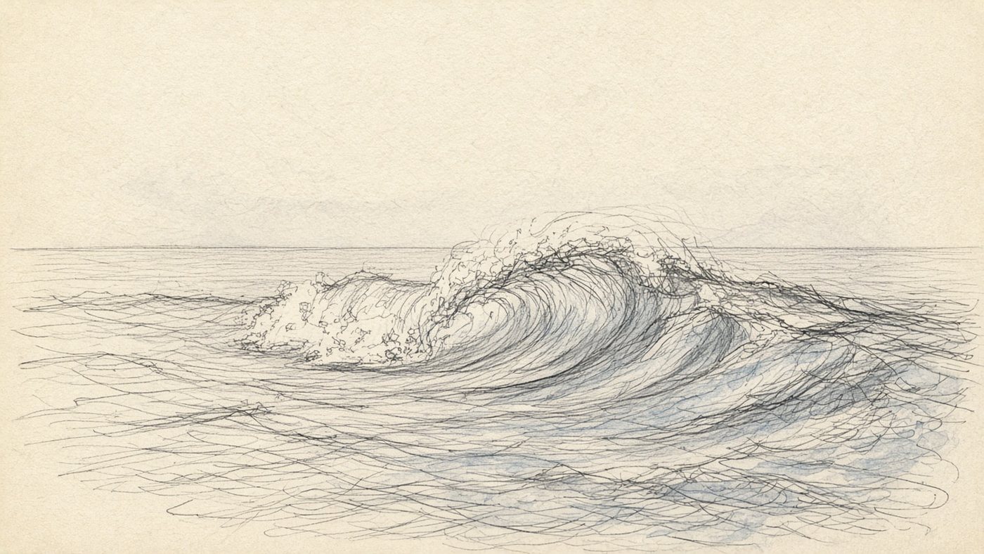
The sea starts with two decisions, before the water: where the horizon sits and how many planes you have. Place the horizon and you know at once whether you are looking at the sea from the sand or from a high cliff. After that the water splits into bands, and each band has its own character.
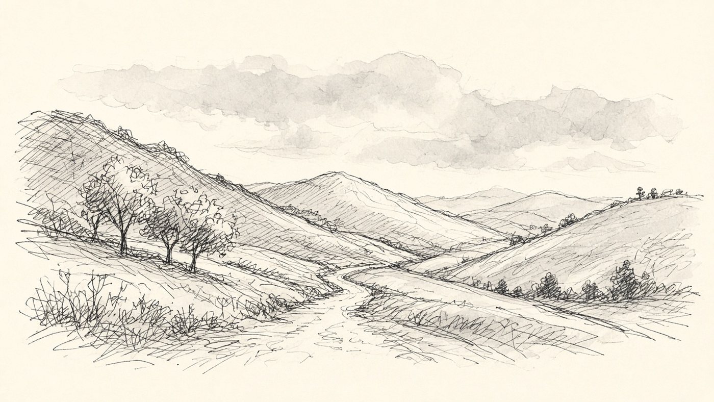
Divide the canvas into four zones: sky, distant water, middle water, and a foreground with a wave or sand. Work from the top down. That makes the value easier to control.
The horizon line is always straight
Water does not bulge at the horizon: however hard the storm, the line stays straight. Draw it with a ruler, or with Shift held down if you are working in an editor. The second rule is to keep the horizon off center. Give the sky two thirds when clouds are the subject, and give the water two thirds when the wave is the subject.
Water planes: distance, middle, foreground
Distant water is an almost even band, a little darker than the sky, with no detail at all. The middle zone is fine ripples in horizontal strokes, and the waves read like lines of text. The foreground is a large wave with transparency, foam, and shadow, and that is where every detail lives. This is the same atmospheric perspective: the farther away, the less contrast and the smaller the stroke.
The color of water
Water is transparent and nearly colorless. Everything you see is reflected sky, sand on the bottom, and depth under the surface. You cannot pick the color of the sea apart from the color of the sky.
Reflection of the sky
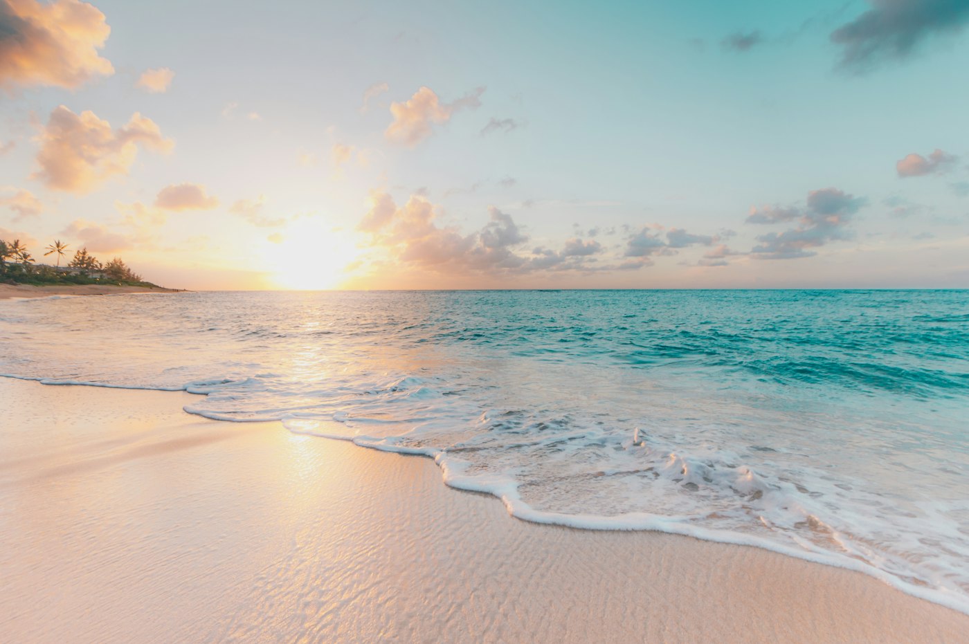
Take the sky color at the horizon, darken it a little, and mute it. That is the color of the distant water. A gray sky gives a gray-steel sea, and a sunset gives a pink-ochre sea. The eyedropper is more honest than memory: sample the hue straight from the sky you already painted and shift it two or three steps darker. How the gradient itself is built is covered in the article on sky and clouds.
Transparency in shallow water
Near shore, sand shows through the water, and the water warms: turquoise and yellow-green appear. The deeper it gets, the cooler and darker it becomes. The color moves into blue, then almost into black. Lay a band of light turquoise at the very edge, a band of saturated emerald behind it, then a deep blue. Three bands are already enough for the depth to read.
The shape of a wave
A wave is not a tooth and not a check mark. It is a mass of water with a slope, a crest, and a shadow under it. As long as you draw triangles, the sea stays a wallpaper pattern.

- Draw the base of the wave as a horizontal. It is parallel to the horizon line.
- Mark the slope: a long, smooth arc rising from the base.
- Place the crest, the highest point, and shift it off the center of the wave.
- Curl the top of the crest forward: the wave is falling, not standing.
- Fill the shadow under the curl. That will be the darkest place in the piece.
- Add a transparent zone in the body of the wave: a band of light green where the sun passes through the water.
- As the last layer, put foam on the crest and spray above it.
Crest, slope, shadow
The slope facing you reflects the sky, so it is light. The inner wall under the curl never sees the sky. It is dark and cool. The crest is thin, and light passes through it, so the water glows brightest right there. Three different values in one wave are the minimum that makes it feel solid.
Light passing through the water
If the sun is behind the wave, its body lights up from inside: a band of bright jade appears along the crest. Keep that band narrow, about a tenth of the wave's height. In an editor, put this light on its own layer and lower the opacity to 60 percent so you do not blow out the whole sea.
Check
Flip the canvas horizontally. If the waves suddenly look wrong and fall apart, you drew them from a familiar formula, not from the form. Adjust the tilts of the crests: they should differ from one another.
Foam and spray
Foam is a ragged, uneven mass with holes, not a white stripe. Put it in at the very end, and use the contrast: this will be the lightest place in the piece.
Foam along the wave's edge
Foam is born on the crest and runs down the slope in tongues. Paint it as patches of different sizes, not as a dotted line. Foam has thickness, so it has its own shadow: lay a gray-blue tint underneath, or it looks like a sticker. Place the spray as dots of different diameters, clustered at the crest and thinning toward the edges.
Lace on the sand
On the beach, foam spreads into thin lace: long, stretched arcs that follow the shape of the shore. Between the arcs, leave wet sand. It is darker than dry sand and slightly reflects the sky. The arcs run along the edge and narrow toward the horizon, following the same perspective as everything else.
Reflections and highlights
A reflection turns a painted surface into water. There are only two rules: the reflection is built straight down, and it is always duller than the object itself.
The path of light
A sun path is thousands of small sparkles, not a beam. It always runs from the sun straight toward the viewer, strictly vertical on the canvas. Near the horizon the sparkles are small and dense. In the foreground they are large and sparse. Place them as horizontal strokes: each highlight sits on its own wave.
Reflections of objects on the water
A boat, a rock, or a person reflects directly underneath, one or two values darker than the object itself. On calm water the reflection is almost a mirror. On ripples it breaks into trembling strips. The physics of this is covered in the article on reflected light.
Calm and storm
The same sea can be drawn in two moods, and what changes is the contrast, not the shape of the waves. Choose the mood before the first stroke.
Calm water in horizontal strokes
- Only horizontal strokes, and no verticals except reflections.
- Minimum contrast: the gap between light and dark is two or three values.
- Almost no foam. A narrow strip at the shore is enough.
- The closer to the viewer, the longer and thicker the stroke.
- Sky and water stay almost on the same value. That is what creates the quiet.
A dramatic storm
A storm runs on extremes: nearly black water, blinding white foam, and a heavy sky. Tilt every crest the same way, add spray torn off by the wind, and lose the horizon behind a veil of rain. One break of light in the clouds gives you the subject: it lights the top of a wave and gathers the eye. The same idea of one accent works in any landscape.
Time to draw, not just read
Theory fades in a couple of days if you never use it. Open the editor and spend 15 minutes on what you just read. That is enough for the skill to stick.
Try it now
A free online editor: brushes, layers, a palette, and a shared canvas. No install and no sign-up.
Start drawingTopics in this guide
- how to draw the sea
- how to draw waves
- seascape drawing
- drawing water
- foam and highlights on water
← How to Draw Flowers: From a Simple Form to a Living Bouquet How to Draw Sky and Clouds: Gradient, Volume, and Sunset →